Reducing Churn After Sign-up at Florence
Care workers were signing up to Florence Flex and then going quiet. We talked to them to find out why, and redesigned how shifts are shown so people could find the right ones.
Overview
Care workers were signing up to Florence Flex and then going quiet. Before building anything, we went back to them to find out why.
Impact
30% → 70%
of people opening shift details before applying
+25%
shift applications
Context
Churn after sign-up was rising. Before anyone started on features, we spoke to current and lapsed users.
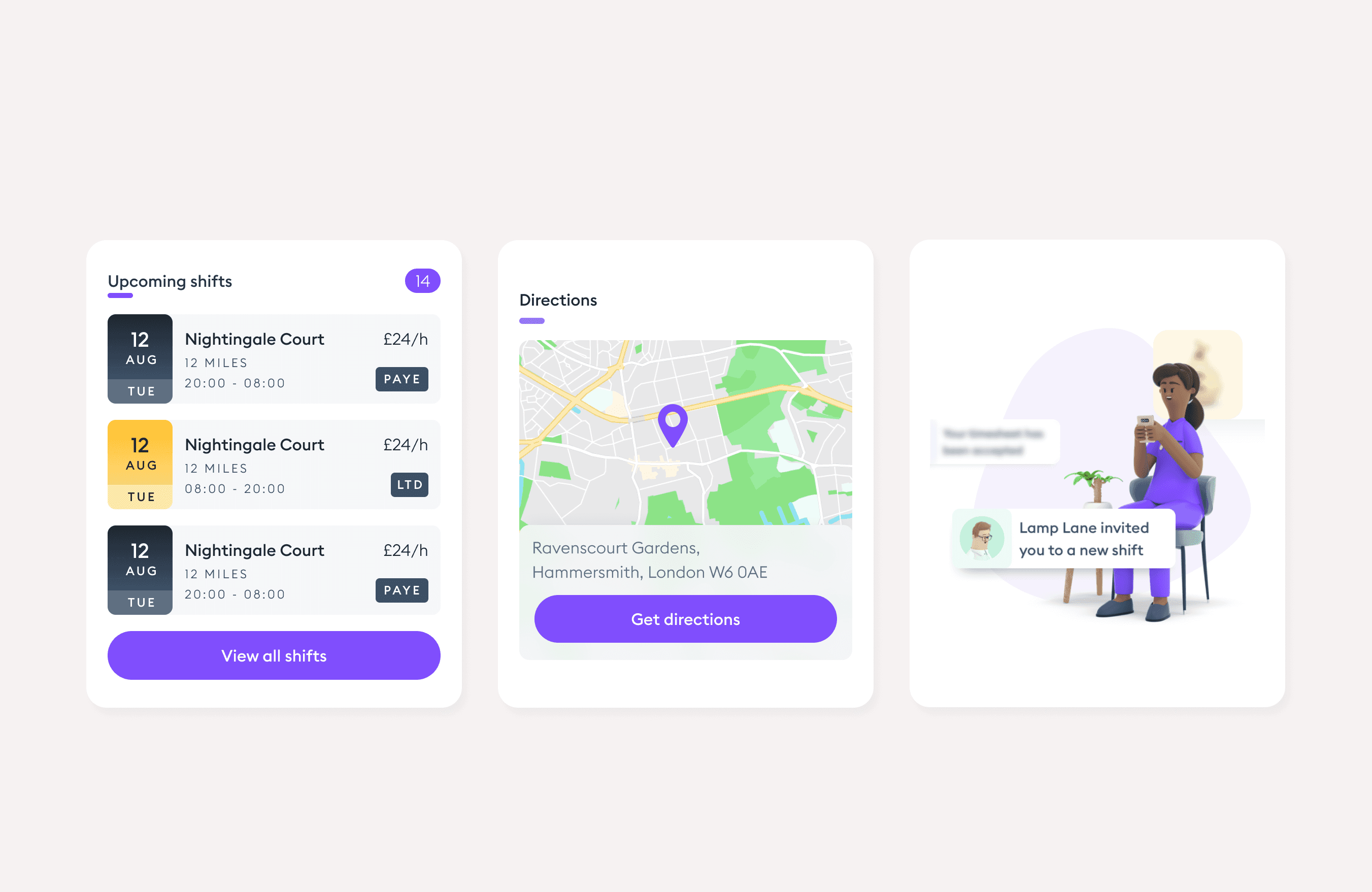
Florence Flex connects care workers with shifts at care homes. We wanted to know what was going wrong before deciding what to build.
What we heard
Three reasons people went quiet.
Judging shifts on very little
Most people only looked at the date, time and place on the list, and missed shifts that suited them.
Afraid of overcommitting
People held back from applying for more than one shift.
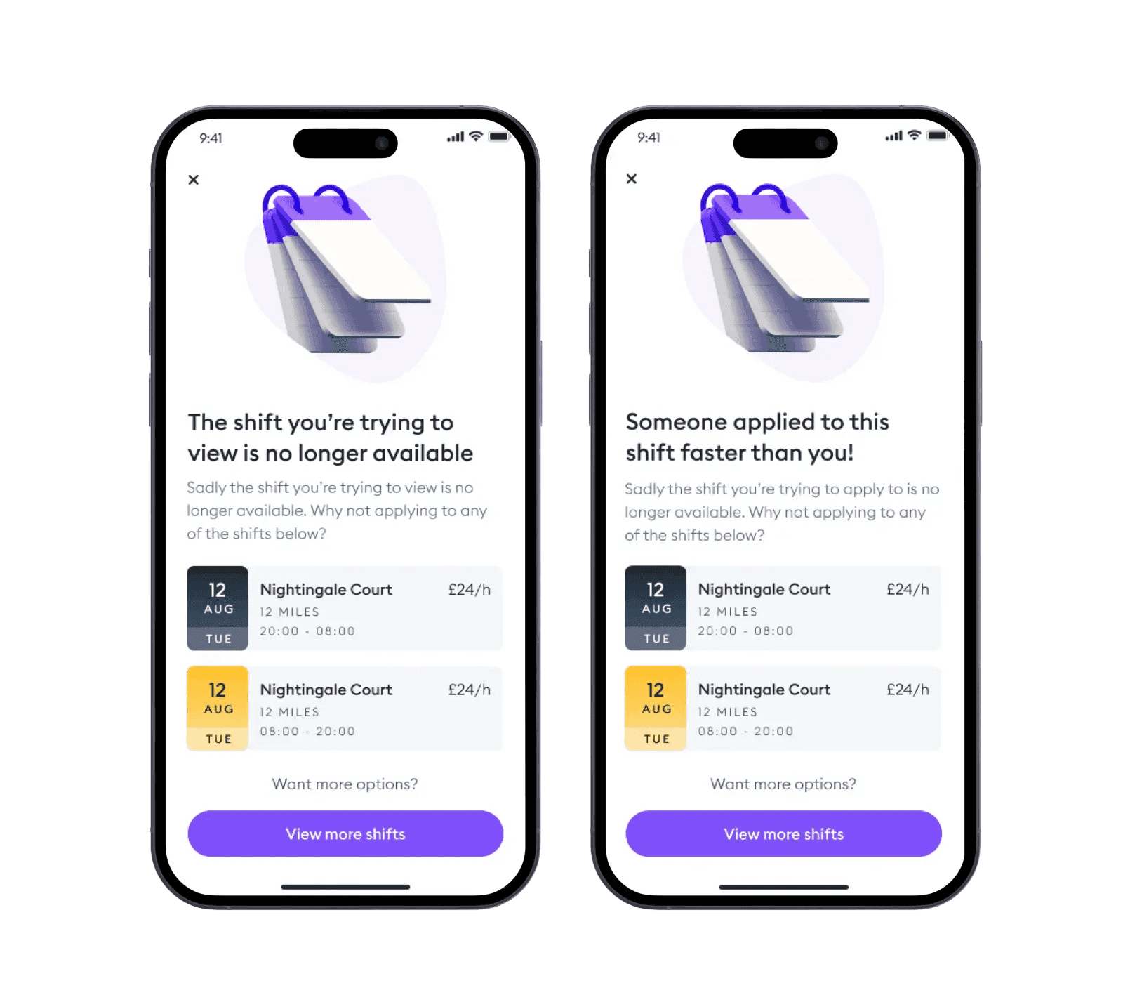
Shifts disappeared
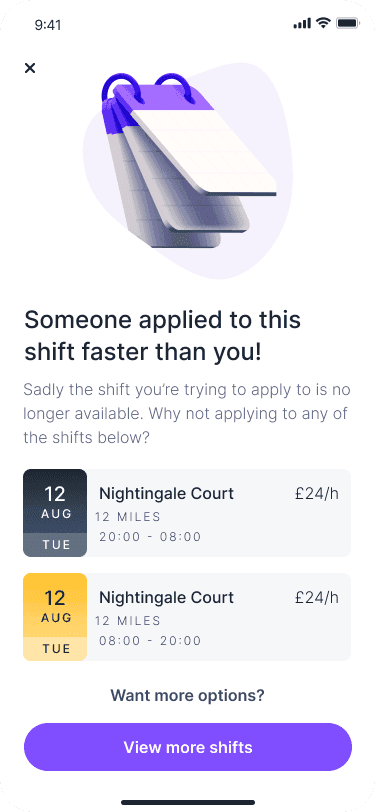
People tapped a notification and found the shift was already gone.
Key design decisions
01
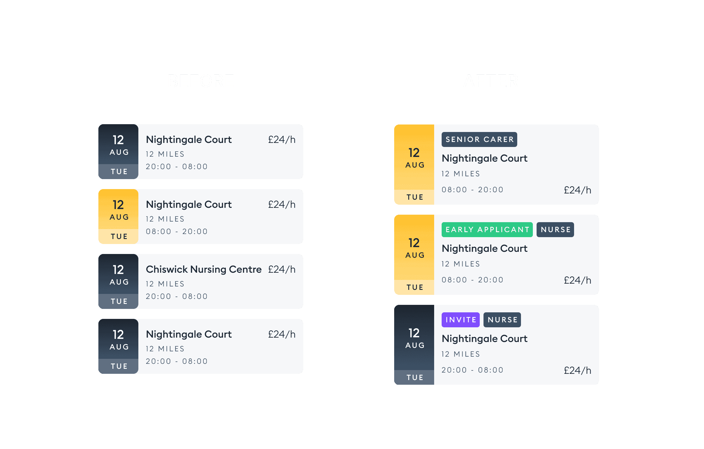
Tags on every shift
- Problem
- The details that mattered were hidden one tap away, so people rarely saw them.
- Decision
- Tags on shift cards for what people cared about: the role, being an early applicant, or a high chance of approval.
- Outcome
- Detail views went from 30% to over 70% of people, and applications rose 25%.
02
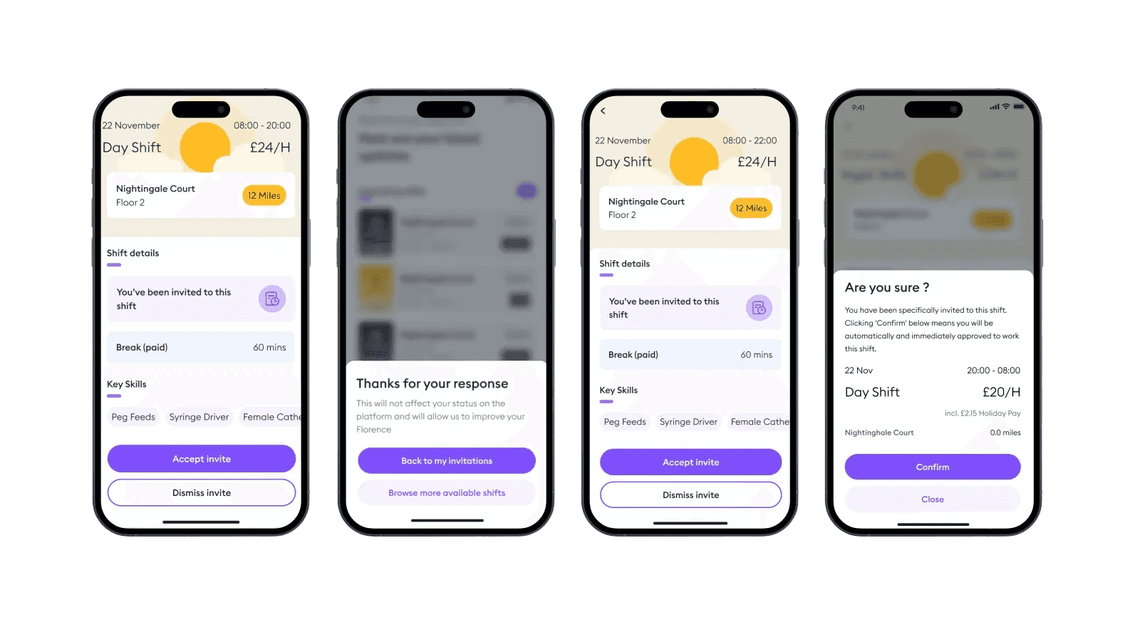
Accept and dismiss, side by side
- Problem
- Dismiss was hidden at the bottom of the page, so lists grew long and care homes got no signal about unfilled shifts.
- Decision
- Accept and dismiss together, fixed at the bottom of the screen.
- Outcome
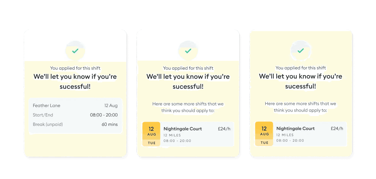
- Shorter lists for workers and clearer feedback for care home managers.
More screens
Building it
I worked with the squad's mobile and backend engineers through handover, designing the states and edge cases that came up along the way. The app is built in Flutter, so one design shipped to iOS and Android.