Reducing churn of workers post sign up
Mobile app churn refers to the rate at which users stop using a mobile application over a particular period of time. It represents the number or percentage of users who uninstall or stop using the app after an initial download or a specific period of usage. High churn rates can negatively impact an app's success as they may indicate that users are dissatisfied with the app's features or experience. Thus, understanding and managing mobile app churn is important for app developers to improve user retention and overall success of the application.
After 6 months of working at Florence and leading the design team through various features a task picked up by the tech team was to examine how we could reduce the increasing churn rate. However first before jumping into features the team decided to speak with current users to understand reasons for churning or potential reasons for churn, this context would be vital in understanding what features to implement.

Client
Florence
Timescale
Jul 24 - Sep 24
Role
Product Designer, Workshop facilitation, Stakeholder management, Rapid prototyping, User research, Visual design,
The challenge
Understanding the user & company needs
Through in-depth user interviews, we identified three primary pain points that contributed to a significant number of users leaving the Florence Flex app inactive or deleting their accounts:
Limited Shift Visibility: Users often relied solely on thumbnails to assess shifts, leading to missed opportunities and a lack of engagement.
Hesitation to Overcommit: Users expressed concerns about applying for multiple shifts due to the fear of overcommitting.
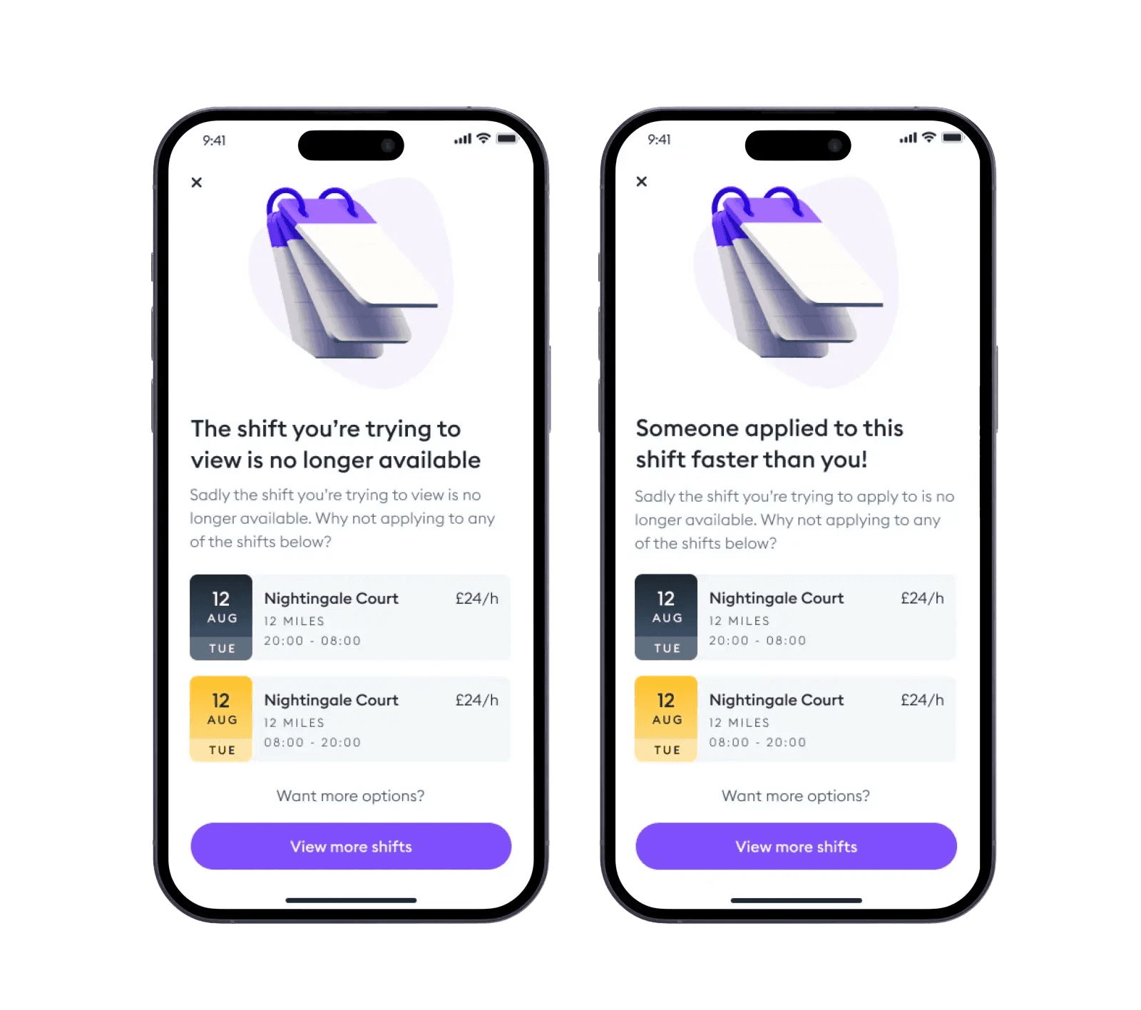
Shift Availability Issues: Users reported frustration with shifts becoming unavailable after selecting notifications.
To address these challenges, we propose the following design solutions:
Enhanced Shift Details: Introduce more detailed information upfront, including shift descriptions, requirements, and potential earnings. This will enable users to make informed decisions without relying solely on thumbnails.
Shift Recommendation Algorithm: Develop a personalized shift recommendation algorithm that suggests suitable shifts based on users' preferences, availability, and past behavior. This will reduce the cognitive load on users and increase the likelihood of finding relevant opportunities.
Real-Time Shift Availability: Implement a real-time update system to ensure that shift availability is accurately reflected at all times. This will eliminate the frustration of users finding shifts unavailable after taking action.
By implementing these solutions, we aim to:
Increase user engagement and retention.
Improve the overall user experience.
Enhance the app's effectiveness as a tool for connecting users with suitable shifts.
To validate these solutions and gather further insights, we planned to conduct usability testing with a representative sample of users. This helped us identify potential issues and refine the design before implementation.
The solutions
01 - Shift Visibility
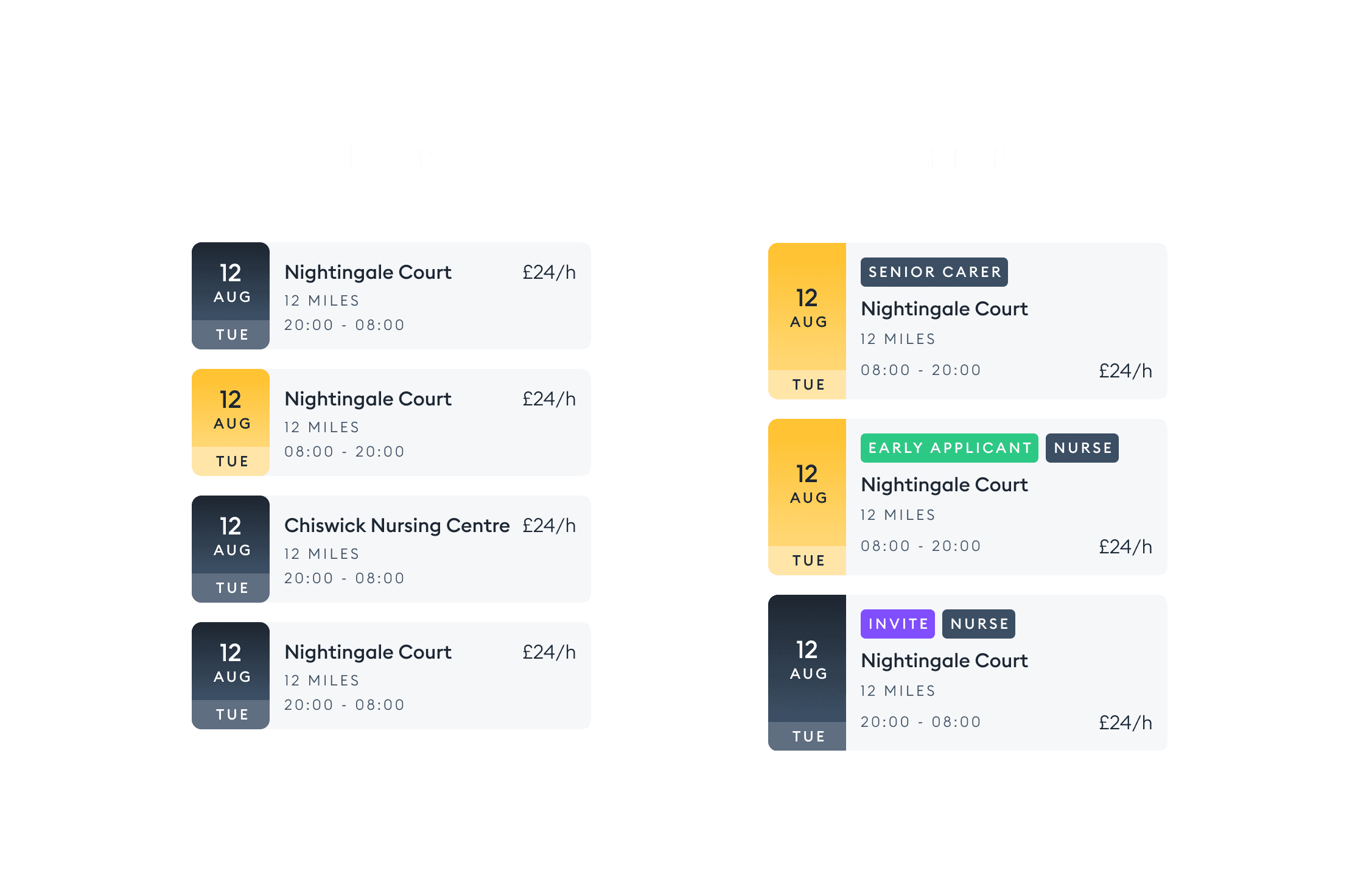
As mentioned users were visiting the app going through the list of shifts but not clicking into shifts to view more details as often as possible. the downside to this was users were missing out on shifts that were potentially perfect for them but were simply just utilising the date time and location to make their decision. After researching a number of different competitors and market places, I was able to identify that a key way to bring this information forward and increase the click through rate on the app was to utilise tags on the shifts. these would be unique aspects of shifts that users often wanted to be made aware of such as 'Early Applicant' ' Shift Role' 'High Approval Chance' and more
Before: Only 30% of users viewed detailed shift information before applying.
After: Over 70% of users now view detailed shift information, leading to a 25% increase in shift applications.

02. Shift Dismissal
Another area observed during discovery was the lack of users who were dismissing or rejecting shifts they were not interested in. It was important to get users to do this for a number of reasons, such as the length of available shifts list, care home managers would have a better idea of the success of some of their shifts posted and can correlate data e.g if a shift had several rejections but also the lowest pay. This was done simply by bringing forward the accept and dismiss invite buttons rather than just the dismiss at the bottom of the page, now both are fixed at the bottom of the screen.

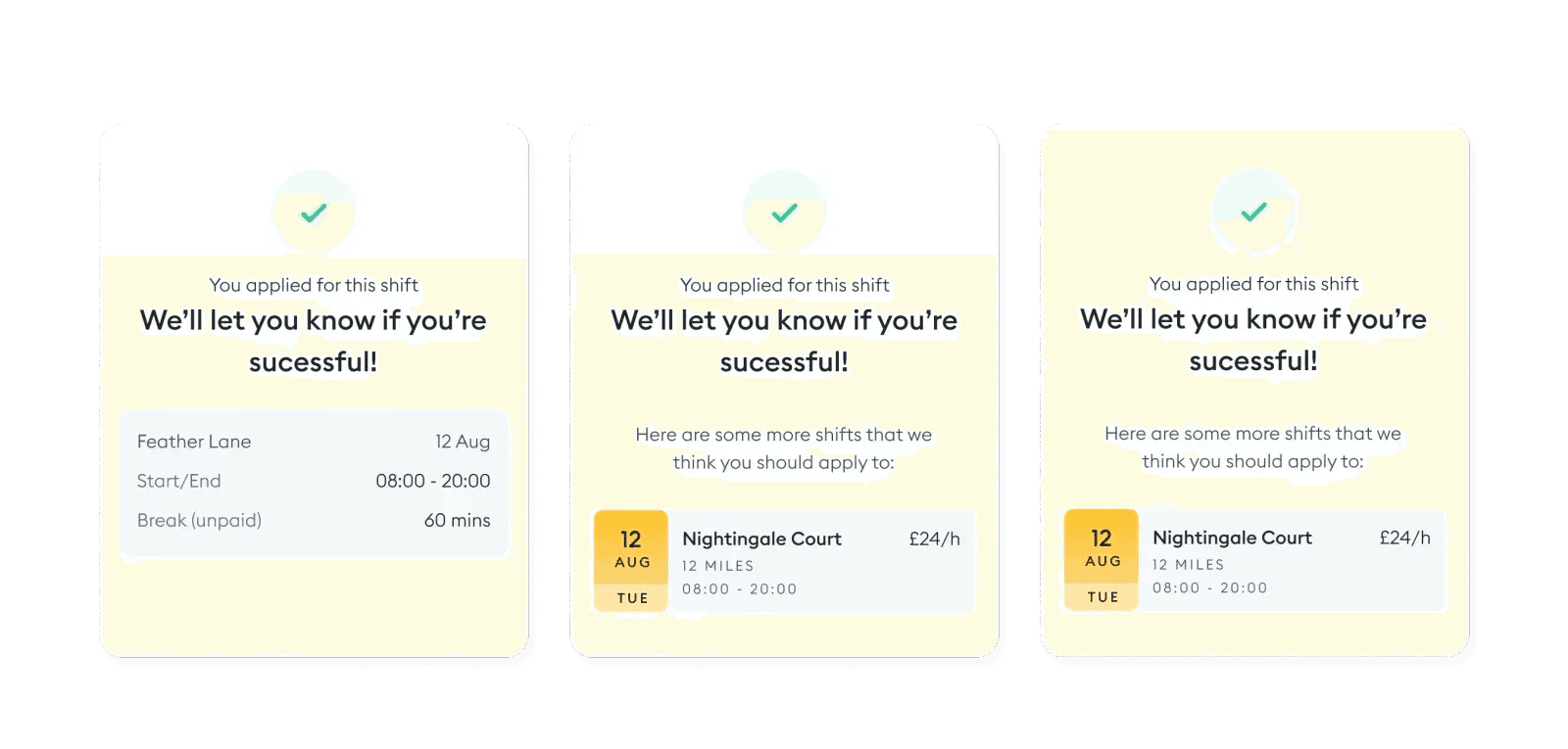
03. Follow up shifts

04. Out of Stock messaging

Implementation
Working closely with the mobile and backend developers of our squad, I helped hand over the designs and also design any component or state that wasn't discussed in the early phases of the project but also ensure that features and flows made sense for the users and didn't impact the feedback we got in the previous step. Some details of the implementation of this feature:
Built using Flutter as our mobile app uses this technology to create a single version of the app and then release it to both Android and iOS from the same source code.